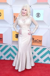
Much to my delight, there were plenty of celebs who really pulled it out this year. In true country music fashion, even the best of the best were bright, flashy, and a little out-there, but in a way that was definitely on the happier side of style. And then, of course, there were those that weren’t, because life’s nothing without a little yin and yang.
Read on for the best- and worst-dressed celebs at the 2016 ACM Awards!
1. Carrie Underwood
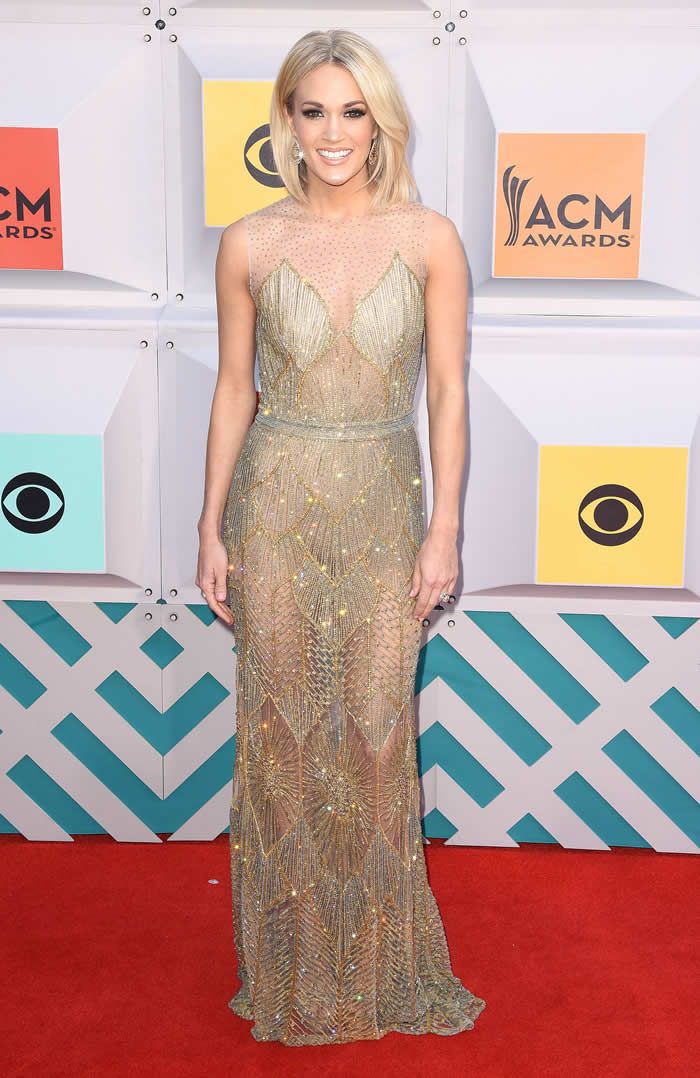
Look, Carrie Underwood is easily one of the most beautiful women on the planet, so it should come as no surprise that she lands the number one spot on this list. This sheer gown kind of reminds me of the one that Nicki Minaj wore to 2015 MTV VMAs that I loved so much, and the trend works just as well on Carrie. The beading is stunning, it’s not too sheer, and her simple hair and makeup were the perfect complement.
2. Kelsea Ballerini
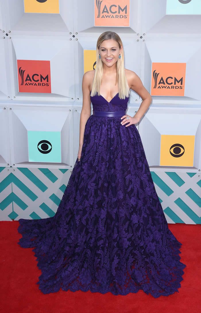
I’ll admit that this looks a bit like an aggressive prom dress, but I wish I looked this good at my senior prom. The color is beautiful, the statement earrings are just the polish Kelsea needed, and the simple hair and makeup keep the overall look from being too overwhelming.
3. Kacey Musgraves
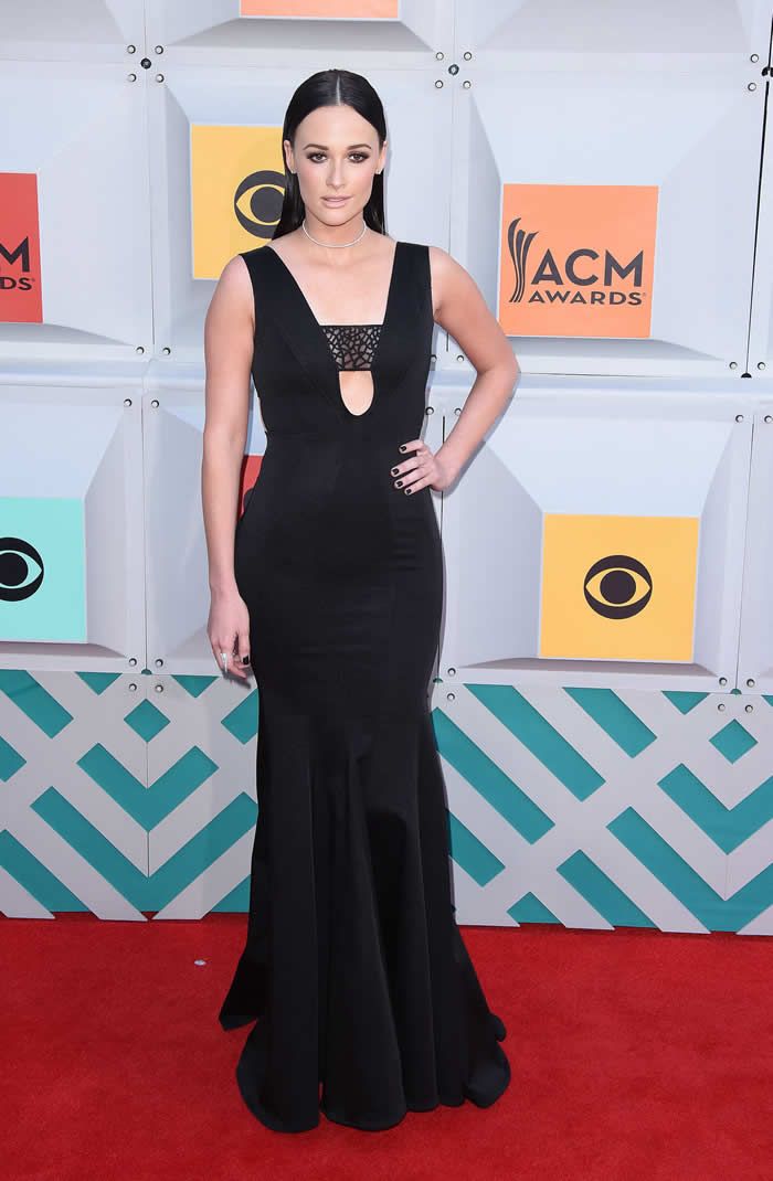
Kacey 100 percent dressed for the wrong awards show—this look would have fit in much better at, say, the iHeartRadio Music Awards—but it was absolutely stunning. This gown fits her like a glove, and the laser-cut detail in the cutout is a really unique spin on a popular silhouette.
4. Nicole Kidman
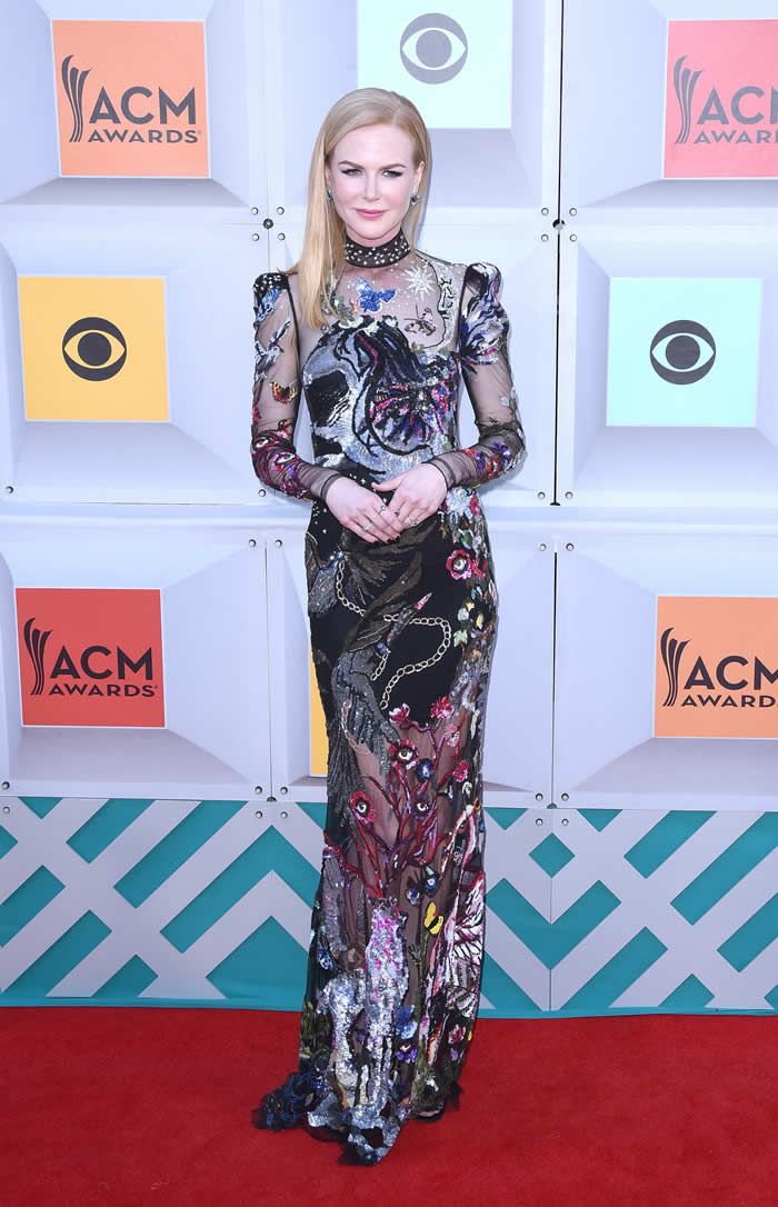
Does anyone else always forget that Nicole Kidman is married to Keith Urban, or is it just me? Regardless, this gown is absolutely stunning, and I’m a little disappointed she didn’t wear it to the Met Gala last year.
5. Miranda Lambert
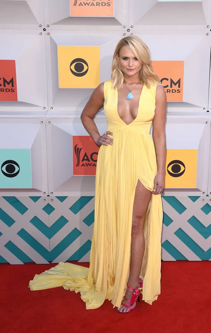
I don’t know that I’m here for the return of Angelina Jolie‘s 2012 Oscars leg, but Miranda Lambert looks so summery and fun here. It’s the perfect look for the ACM Awards.
6. Jessie James
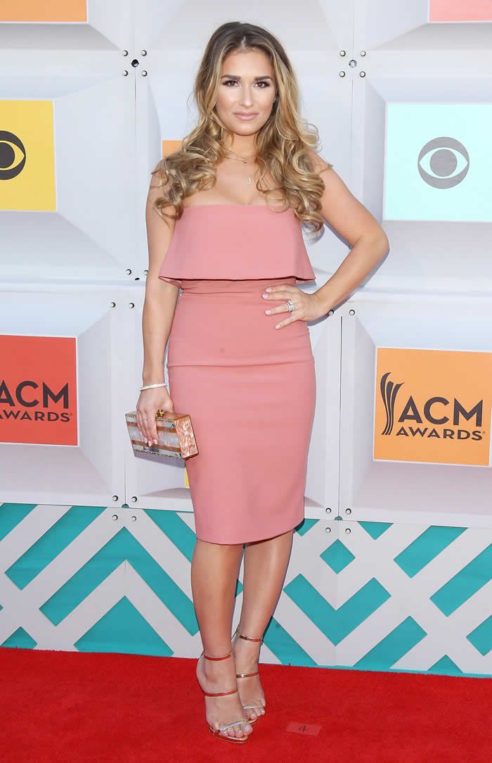
This is definitely one of the more casual looks of the night, but it’s also one of the only ones I could actually see myself wearing, and that makes it a winner in my book.
7. Betty Cantrell
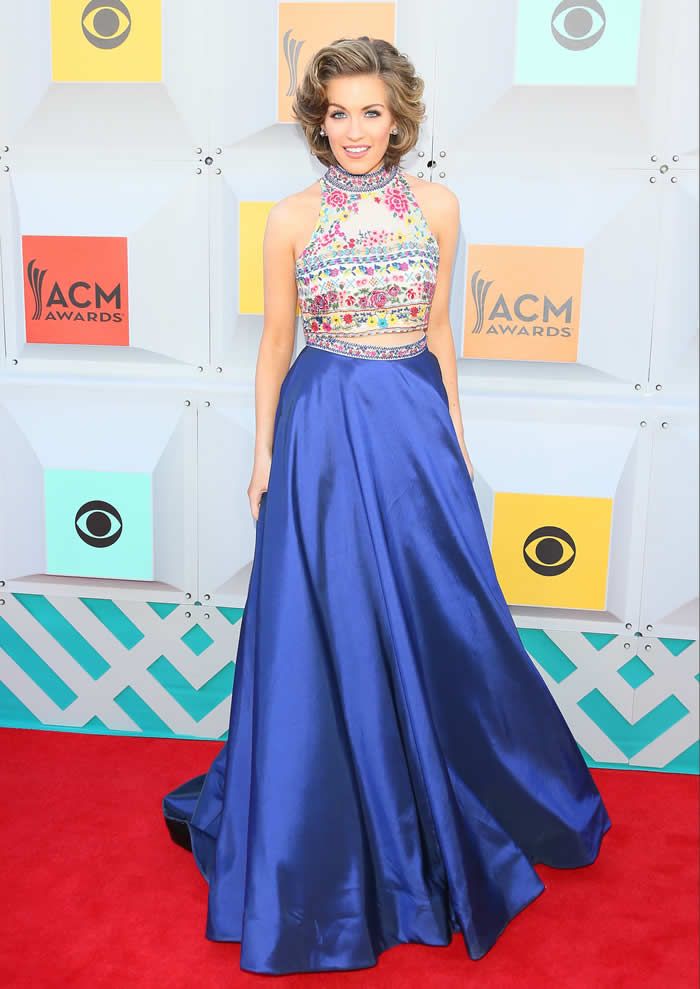
I don’t know why I love this, but I do. It’s so bright and fun, and it just seems like something that could look different on anyone depending on how they style it. Like, maybe it would be better without the almost ’50s housewife-esque hair and pristine makeup, but this is still pretty great.
8. Katy Perry
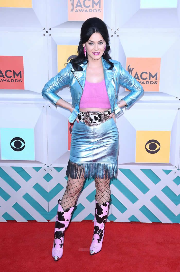
Obviously this outfit is full-on Jeremy Scott, but that doesn’t make it okay. It blatantly doesn’t fit, those boots are heinous, and just say no to oversized fishnet stockings, okay?
9. Caroline Boyer
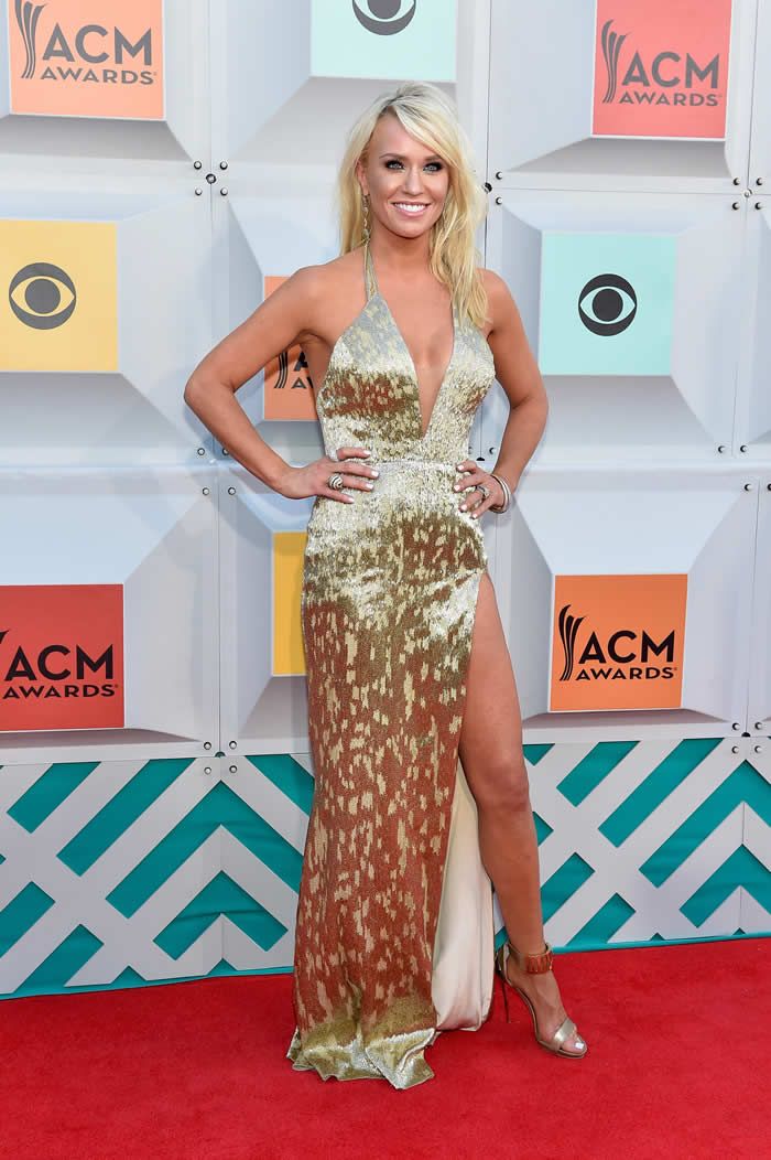
And here we have the tacky Showgirls style homecoming dress of your nightmares!
10. Maggie Rose
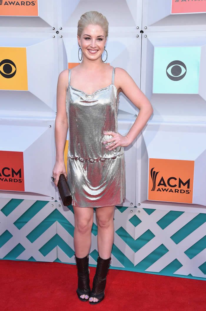
I think Maggie was trying to go for a kind of late ’60s, early ’70s vibe here with the big earrings, big hair, and metallic dress, but she really missed the mark on all counts. The silhouette of that dress is bad 2000′s, and honestly, it’s just not the right way to wear metallics.
11. Karen Fairchild
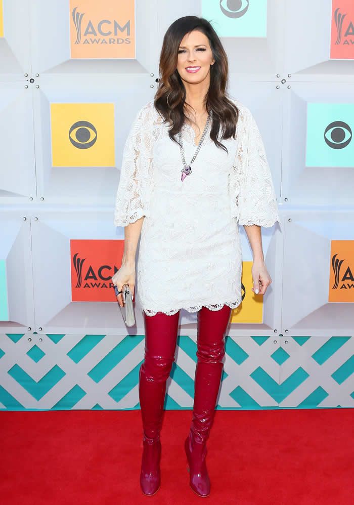
Just, like, the HARDEST nope ever to those boots. The only two people who could pull them off are Lady Gaga and the Red Devil in Scream Queens, and as Karen Fairchild is neither of those people, I can’t get behind this styling choice.
12. Lauren Alaina
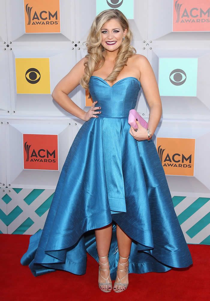
Nothing against Lauren, because she does look and this was very well-styled, but I just don’t think this is a flattering cut for anyone who isn’t tall AF. Taylor Swift can just manage to pull off a mullet hemline, but it kind of swallows Lauren up and makes her look shorter. Also, we can all agree that this material is awful, right?
13. RaeLynn
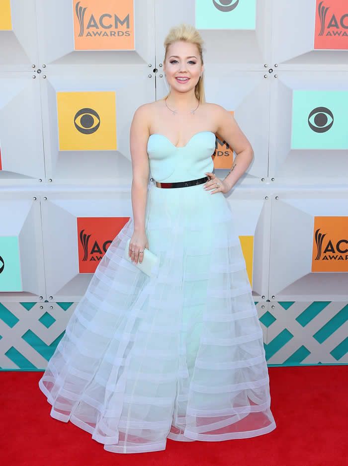
Not only does the bodice not look like it fits her properly, but this powder blue color makes the gown seem more like an attempt at a Cinderella costume than an actual red carpet dress.
14. Lindsay Ell
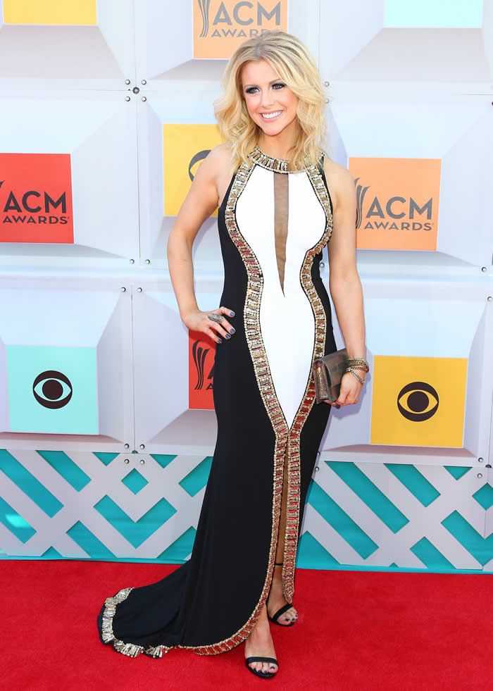
This has to be the most disappointing look of the night for me. When I first saw it, I only saw the top half, and I thought I was on board. The cut of the top is very pretty, and the color combination really had a shot, but the white center of the dress should have gone all the way down the front in one even column rather than tapering off into a weird front cutout, and the train is just unnecessary.
Via: thegloss


