Furniture (and how you arrange it) can make or break your home. Too much and you’ll feel overwhelmed and uncomfortable. Pick the wrong spots and you won’t be able to move freely through your space. Arranging furniture is about creating a natural flow in your home. It is about living comfortably and happily in harmony with your possessions. Unfortunately, it’s all too easy to get it wrong, and often results in a home that feels cluttered and badly managed. Here are some very basic rules to furniture arranging that can prevent this self-sabotage, and guarantee you too can live in harmony with your furniture. We promise!
Problem 1: Buying Furniture First

A new home and fresh start bring with it a flurry of excitement at the thought of furniture and the opportunity to start over. In that excitement, we often find ourselves running out to IKEA or our favorite furniture stores in a mad dash to fill our rooms with pretty things. This usually results in a lot of great individual pieces that seemed irresistible in the store, but in reality don’t work with your space or each other. With furniture that’s too large or just doesn’t account for the architectural design of the room, you might soon be headed back out, receipts in hand, for a whole lot of returns.
Solution: Plan, Then Buy
Try to contain your excitement for just a little longer, and take the time to plan properly. Measure your room, consider its scope and decide what ultimate purpose you would like that room to serve. Interior designer Laurel Bern of Laurel Home sees this problem all too often when dealing with first time clients and has sage advice. “You begin by giving yourself a little quiz. What do you want to be able to do in this room? How many people would you like to be able to sit in it (comfortably)?” Taking a quiz helps you get a better understanding of what you would like your room to be, and is the first step towards creating a well-arranged and successful space. Another great tip comes from staging pro Cathy Hobbs, who notes that “seldom is buying the set successful. For most people, it’s too much furniture.” So don’t feel like you need to splurge on the entire living room set. Buy what your home can handle.
Problem 2: Forgoing a Focal Point

It may sound dramatic, but ignoring or forgoing a focal point can lead to a room that has no soul. A room needs a heart from which to draw its energy. Without that, you may find yourself feeling uncomfortable and unsettled. Where to sit? Which way to face? Where to gather together? These everyday questions become real conundrums in a room that doesn’t come with directions.
Solution: Zero In
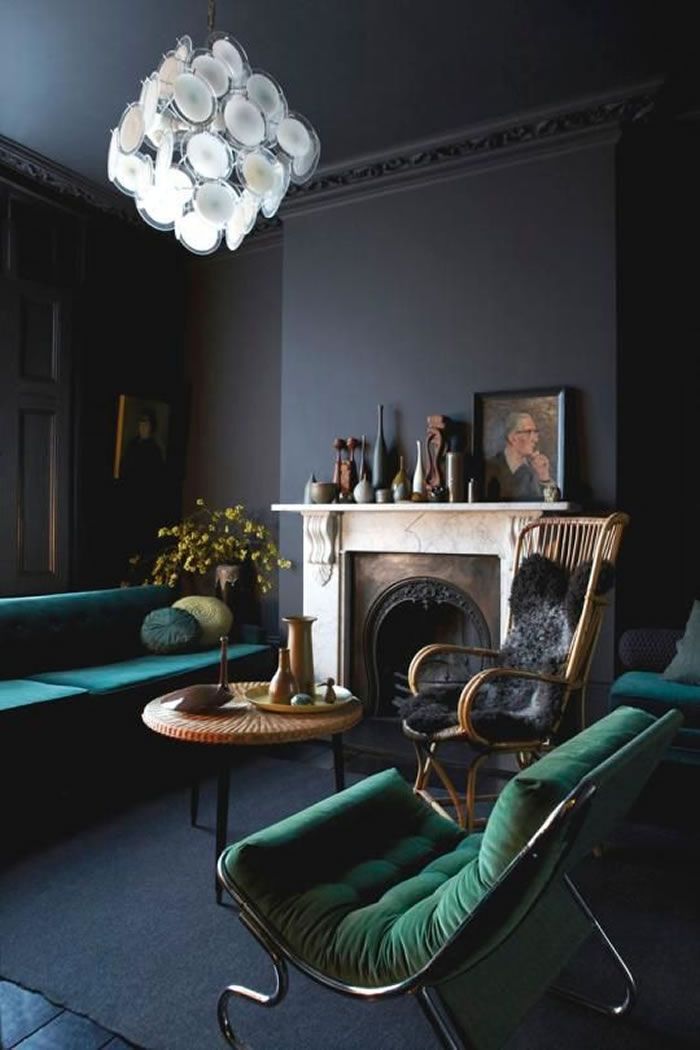
Focal points can either be found built into the architecture of a room, or they can be created manually. If you’re lucky enough to have a fireplace built in to your wall, use it to harness the room. Place your couch or chairs so that they face the flames and build the rest of the room accordingly. Alternatively, if you’re lacking architectural directions, focus the room’s energy onto a grand mirror, piece of art or, if the purpose of your room is watching TV, a television. Also important to note is that if you’re in the market to sell your home, focal points will put buyers at ease. The experts at Stage My Own Home note that “a bold or lovely focal point will also distract home buyers from seeing the flaws in your home.”
Problem 3: Overcrowding a Space

Sometimes more is just too much! Filling a room with more furniture than it can comfortably hold leads to a feeling of claustrophobia and discomfort. Clutter, no matter how clean and ordered it is, can make a room feel overwhelmed and all-together unwelcoming. Having ten chairs in a room may feel like you’re creating a suitable space to entertain, but in reality no one will want to sit where they can’t breathe easily.
Solution: Simplify
The key? Simplify, simplify, simplify! When arranging furniture, you have to learn to edit. Pick three pieces you absolutely want in a room, then be ruthless with the rest. Do you have enough seats to accommodate your household with one or two additions? Then stop there! People will huddle up, or in a case of emergency, a neatly stowed collapsible seat or two will come in handy for occasions that draw a crowd. Freshome has a great tip to avoid that over-furnished feeling: “If your space does start to become cluttered, pack some items away and rotate them in at a later time. This can help keep your space fresh.”
Problem 4: Living on the Edge

Pushing all your furniture to the edge of the room will leave you with a lot of awkward, dead space in the middle, and put a real damper on relaxed conversations. In a room where the couch sits against one wall and the armchairs sit against another, it’s very difficult to create a sense of togetherness or comfort. With too much space in the center of a room, and no facilitation for communication, a room feels cold and uninviting. Perhaps surprisingly, this method of arranging furniture actually makes the room appear smaller, as there are no cohesive points of interest for the eye to zero in on.
Solution: Huddle Up
Celebrity designer Angelo Surmelis suggests that “placing a couch even a few inches away from the wall will create a little breathing room and make a space seem larger,” and we couldn’t agree more. Also, creating an area that takes its inhabitants into consideration will provide a cozy feel in a more breathable space. Arrange your couch, coffee table and chairs in a comfortable cluster, keeping the focal point of the room in mind. This will bring the room together and make it more inviting.
Problem 5: Stretching a Room Too Thin

If you have a large, long room and you’re trying to stretch its contents across the length of it into one big seating or living area, you’re doing the room a disservice. It’s nearly impossible for someone sitting in a chair at one end of the room to connect with someone sat in the couch at the other end of the room. Or perhaps you’ve piled all your furniture up at one end and find yourself with a blank space at the other, resulting in a lopsided feel. Either way, you’re not making the most of all that lovely space you have to work with.
Solution: Divide and Conquer
The key is division! No one ever said you have to have only one communing area in a room. In fact, you can have as many as your room will comfortably hold! “When you have an extremely large and long area to work with it may look a little stark to create a small intimate space in the center of the room,” say the design experts over at House Envy. “In this case it may be necessary to think of some ways to create two spaces in one open area.” Perhaps the dining table and chairs find themselves grouped at one end of the room, and a love-seat and two armchairs find themselves circling a low coffee table at the other. Arranging in this way also allows for multiple activities in one room, without requiring participation from everyone.
Problem 6: Masking Your Favorite Piece

Remember what your room is all about! When you walk into a bedroom and the bed is the last thing you notice because your desk is overwhelming or your chairs get in the way, it can be a bit confusing. Having no sense of order or purpose can make an otherwise peaceful room seem difficult to navigate, and underplaying your favorite pieces can lead to a disappointing end result.
Solution: Let It Shine
Pick your favorite piece of furniture and make the room be about highlighting it. Your bed is probably your most valued element in your bedroom, in which case you should have the rest of the furniture cater to it. For example, have an armchair that faces and compliments your bed, drawing the attention inward as opposed to away.
Problem 7: Ignoring Form and Function

We’ve all been in bedrooms where you can’t open dresser drawers without scraping the bed frame and living rooms where every time you stand up from the couch your knees hit the coffee table. If the purpose of a piece of furniture is to open its drawers, placing it somewhere where it can’t fulfill its function doesn’t make much sense. It’s important to allow space to enjoy both a piece of furniture’s form and its function.
Solution: Get Practical and Space it Out
According to our friends over at Apartment Therapy,“you should have about 3 feet of walking space around the room. This is what you need to be comfortable, without knocking into furniture and bumping into walls.” We consider this a great rule of thumb. After all, you want to be comfortable in your space, not fighting your furniture.
Problem 8: Forgetting First Impressions

When you walk into a room and the first thing you see is the ugly back of a couch, it’s not exactly inviting. Being greeted by an eyesore is no way to enter a room – it’s disappointing and can put you and guests off a otherwise wonderful space. A room, like anything is, is about first impressions. If something is visually off-putting, it’s very likely we move on from it, rather than stopping to take a closer look.
Solution: Put Your Best Foot Forward
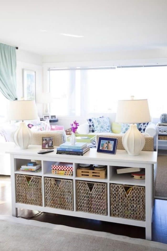
Lead with your best and invite people in with something beautiful and eye catching. If the back of your couch is drab, tattered or simply underwhelming, position the piece so it’s less visible. Instead of having the back straight on as you walk into the living room, place the couch so that you have a side view instead. Doing this will also open up the space instead of blocking it off. If the constraints of your room make this impossible, hang a beautiful throw over the back or place a sideboard against it. That way, you see something interesting before you see the back of the couch. Remember, a room should be inviting, welcoming and open to visitors, so let your furniture signal that.
Via: yahoo


