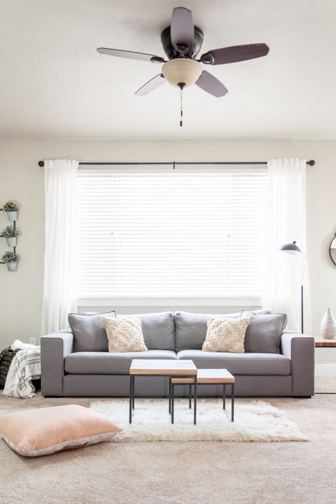
Often, people can be wary of committing to this trend entirely, at risk of it looking boring, but this doesn’t have to be the case. If you follow the trend, or even some of the trend correctly, it can bring a trendy yet tranquil mood into your home.
Think About Your Colour Scheme
Or should I say, don’t think too much about your colour scheme, just think neutral. Minimalism was partly inspired by both the Chinese belief in Feng Shui, and the Japanese culture. The Japanese culture, in this respect, is a fusion of zen and simplicity and a focus on the present experience, with the belief that every non-essential to this experience is not necessary. So, remember this when creating your minimalist haven.
Neutral base colours are one of the most important foundations for the minimalist look. Often these are based on a monochromatic palette, however you can opt for slightly warmer neutrals if you so desire. Despite the overall scheme being neutral, remember to branch for different neutral shades and colours to stop your room looking too one-dimensional. Choose one shade to dominate the majority of the room, another shade to act as a coordinating secondary colour, and finally a third colour reserved for accents only. Because of the simplicity of this decor, it allows possible buyers to see the full potential of the home in its simplest form, and therefore you’re more likely to get a quick sale and a decent offer. Plus it’s the height of fashion – what’s not to like!

However if you do find yourself wanting to infuse some colour into the room, make sure you’re choosing the right colours. Solid pigment earthy colours, for example browns, blues, tans and greens are easy on the eyes and will massively compliment the space.
Furniture is Key
Furniture is going to be the key to your minimalist room looking complete. Rooms like this are based on their function, and what better way to mark the function of a room than through it’s furniture? To make your furniture stand out even more, don’t be afraid to leave empty spaces in the room.
With everything else being so minimal, don’t be afraid to invest in some really high quality furniture that demand the attention they deserve! But remember, not too many items, because you’re going for the MINIMAL look. Aesthetically, remember that natural materials and simple clean lines will compliment the minimalist look better than anything else. When thinking about your furniture placement, think logically, starting with the essentials. Then question, do you even really need anything else? Remember it’s quality, not quantity.
Don’t Neglect Accent Accessories
Just because it’s minimal, doesn’t mean there isn’t space for accessorising. A simplistic space may look empty without the addition of accessories, so they’re in fact the perfect way to finish the room.
Think about objects such as candles, oil burners and interesting lighting choices like Himalayan salt lamps lend particularly well to the minimalist trend, in adding a tranquility to the atmosphere. Coffee tables and shelving also work well in not only neutral colours, but in pretty much any shade of wood you like.
Remember to think about plants too. Nothing sets off the minimalist trend more effectively than bringing the outdoors in and adding some greenery to the atmosphere! Using differently textured natural materials is also a great way of infusing nature into this look.
One in, One out
Finally, try and live by the philosophy of “one in, one out”. Think about how easy it is to accumulate more and more and more possessions and ending up with no space to put them in. This will entirely defeat the point of the minimal theme you’re going for, both literally and metaphorically. Going minimal is actually a great way to reduce waste and create space. It’s as easy as this: for every new piece of furniture or item you get, dispose of an old one. This way you’ll never end up cramming everything in.


