Villa Moerkensheide was designed and built by Dieter De Vos Architecten in De Pinte, Belgium. It’s a very spacious residence with a total living space of 306 square meters but the most interesting thing about it is the way it was organized.

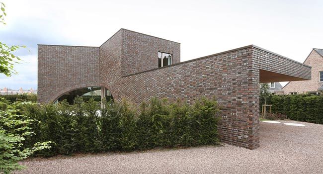
The house was built in the center of the plot and was designed as a series of three cubes around an equilateral triangle. This allows it to be perfectly symmetrical. Three gardens surround the house and each one is intended for a specific time of day.
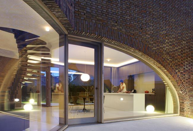
At the center, where the cubes meet, the architects designed three large arched windows which seem to form void at the ground floor. The windows stretch across the walls and reveal the three gardens. They each have a glazed central door.
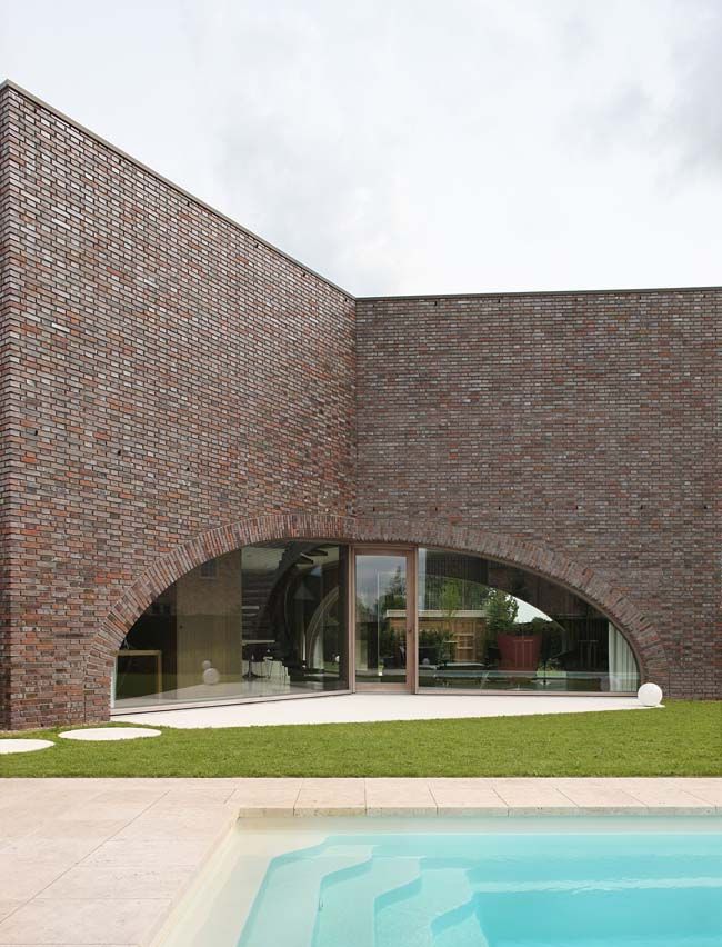
The living area has an open floor plan and is filled with natural light. The large arched windows connect the interior spaces with the gardens and also help define the spaces. The ground floor houses the dining area, the seating area and the work area.
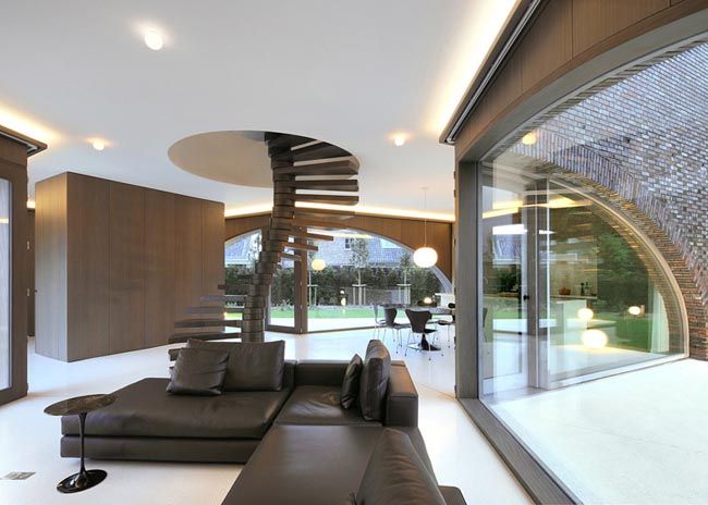
The dining space also has an open kitchen, the space feels very harmonious. A combination of warm and cold colors was used here. The wood paneled walls and cabinets are complemented by a light-colored floor, a matching kitchen island and 6 elegant black chairs.

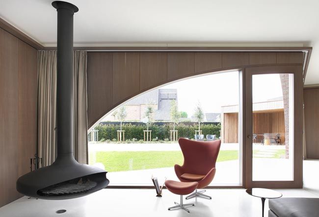
The seating area feels very intimate and inviting. The huge windows can be covered with long curtains featuring a beautiful shade of brown. Different tones of this color were used for the rest of the décor as well. The leather sectional sofa fit perfectly in here.

The suspended fireplace is a very stylish detail. It was strategically positioned so that it stands out without being situated at the center of the room and so that the seating area can still be organized around it. Cove lighting gives the room a very pleasant and relaxing feel.
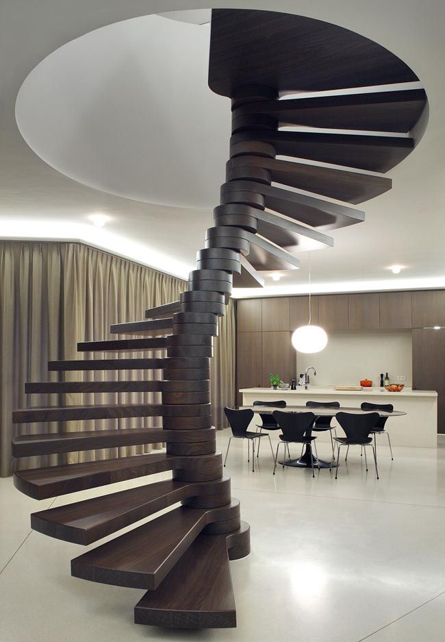
Placed at the center of the ground floor, where the three areas meet, a spiral staircase serves as the main focal point for the entire floor. Built around a twisting spine, the staircase disappears through a round opening in the ceiling and leads to the upper floor.
The upper level doesn’t feature the same type of arched windows. In fact, daylight is quite limited here and only gets inside through perforations on the end walls and in the ceiling.
This level is a private zone containing spaces such as the bathrooms, hallway, the guest room and bedroom. The areas are separated by a series of three full-height cabinets which serve as partitions between the rooms. The whitewashed brick walls make the white spaces feel more inviting.
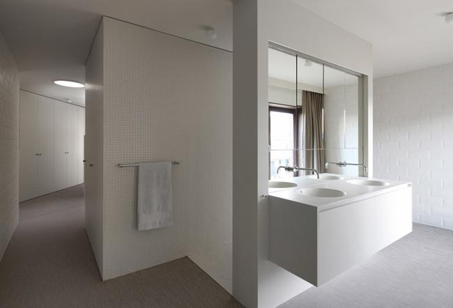
White is the dominant color for this portion of the residence. This creates a strong contrast with the ground floor where dark wood defined all the spaces.


